
You’ve probably noticed how certain colors just seem to go together. Like how navy blue and white is a classic combo. Or how black and red is super edgy and bold. But have you ever wondered why some color pairings work while others totally clash? The reason behind it is actually a whole science called color theory. And for fashion designers, it’s incredibly important to understand. See, picking the right colors can make or break an entire collection. So if you’re interested in creating amazing outfits that wow on the runway, you gotta get the basics of color theory down first. In this article, we’ll break down the psychology behind color and give you pro tips to start rocking color combos like a true fashionista. Get ready to learn why color can make all the difference in your designs!
An Introduction to Color Theory
Color theory is one of the most important concepts to understand in fashion design. The colors you choose for a collection can make or break how well it’s received.
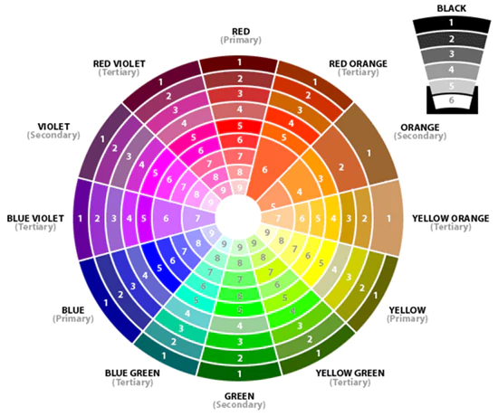
As an aspiring fashion designer, you need to know the basics. The color wheel is made up of three primary colors – red, blue and yellow. Secondary colors are created by mixing two primary colors, like orange, green and purple. Tertiary colors are made from primary and secondary colors.
Complementary colors are opposite each other on the wheel, like red and green. They create high contrast and vibrant looks. Analogous colors are next to each other, such as blue, blue-green and green. They produce harmonious color schemes. For bold but balanced looks, try triadic color combinations using colors that are evenly spaced on the wheel.
Color theory also considers the psychological effects of different hues. Warm colors like red, orange and yellow are energetic and bold. Cool colors such as blue, green and purple seem more calming and relaxed. Pay attention to these associations when designing a collection.
Understanding color theory is key. Apply it to build cohesive collections with colors that evoke the right emotions and energy for your brand. Master these foundational skills, and you’ll be well on your way to becoming a fashion design pro.
How Fashion Designers Use Color Theory
As a fashion designer, understanding color theory is crucial. The colors you choose can make or break a collection. Here are some of the main ways designers use color theory:
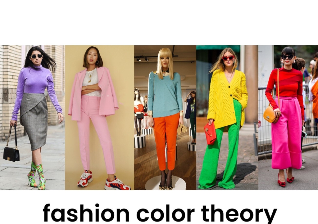
Color harmony refers to the pleasing combination of colors. Designers carefully pick complementary, analogous or triadic color schemes to create harmonious looks.
Contrasting colors like blue and orange or red and green placed next to each other create visual impact. Used skillfully, contrast can attract attention and make a dramatic statement.
Monochromatic color schemes using different shades and tints of the same hue are versatile and pleasing to the eye. Adding neutrals helps monochromatic outfits avoid looking boring.
Color psychology considers the emotional effects of colors. Warm colors like red and yellow are energetic and cheerful, while cool blues are calm and serene. Choosing colors that evoke the right mood and tone is key.
Trends also influence color choices. Staying on top of the latest color trends and forecasting future ones is an important part of a fashion designer’s job.
Using the color wheel and understanding concepts like color harmony, contrast and psychology gives fashion designers a powerful set of tools. Applying them skillfully and keeping an eye on trends results in eye-catching designs that resonate with customers. Color choice is a make-or-break decision, so mastery of color theory is essential for success as a fashion designer.
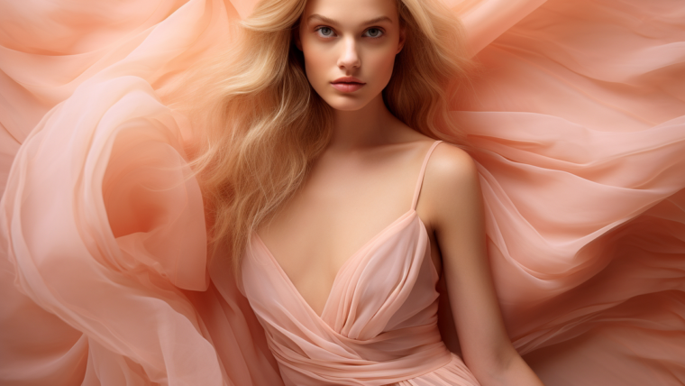
The Psychology and Meaning Behind Colors in Fashion
The colors we choose to wear say a lot about our mood, personality, and the impression we want to make. Fashion designers carefully select colors that will evoke certain emotions and associations in those who see the clothes.
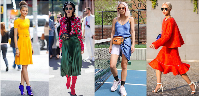
Red is a bold, energetic color that signifies passion, love, and excitement. Wearing red will make you appear confident and draw attention. Yellow, like sunshine, creates feelings of happiness and warmth. Adding yellow accents or clothing is a great way to brighten your mood and the moods of others.
Blue is a calming, trustworthy color that signifies intelligence and stability. Different shades of blue, from navy to light blue, can be used for different effects. Dark blue is authoritative while light blue is more peaceful.
Green, the color of nature, relaxes us and signifies growth, health, and renewal. Shades of green are popular in casual, eco-friendly clothing lines.
Black and white are classics that never go out of style. Black signifies sophistication and mystery. White signifies purity, cleanliness and virtue. Pairing black and white together creates a stylish contrast.
The colors fashion designers pick are never random. They use the psychology of color to evoke specific emotions and impressions that match their brand and style. Paying attention to color theory will make you a savvier fashionista, able to choose colors that boost your confidence and make the statement you want. Understanding why certain colors are used in designs will give you a deeper appreciation for the artistry in fashion.
Conclusion
So in the end, color can have a huge impact on your fashion designs. Don’t underestimate the power of color theory. Thinking carefully about the colors you use and what impressions they give can take your designs to the next level. You’ll be able to create collections that really resonate with your target customers. And you’ll stand out from other designers who don’t pay as much attention to the colors they use. Keep learning more about color theory and how to apply it. Experiment with different color palettes. See what happens when you take some risks! The more you learn, the more creative you can be with color in your fashion design career

0 Comments
IejViwWDv